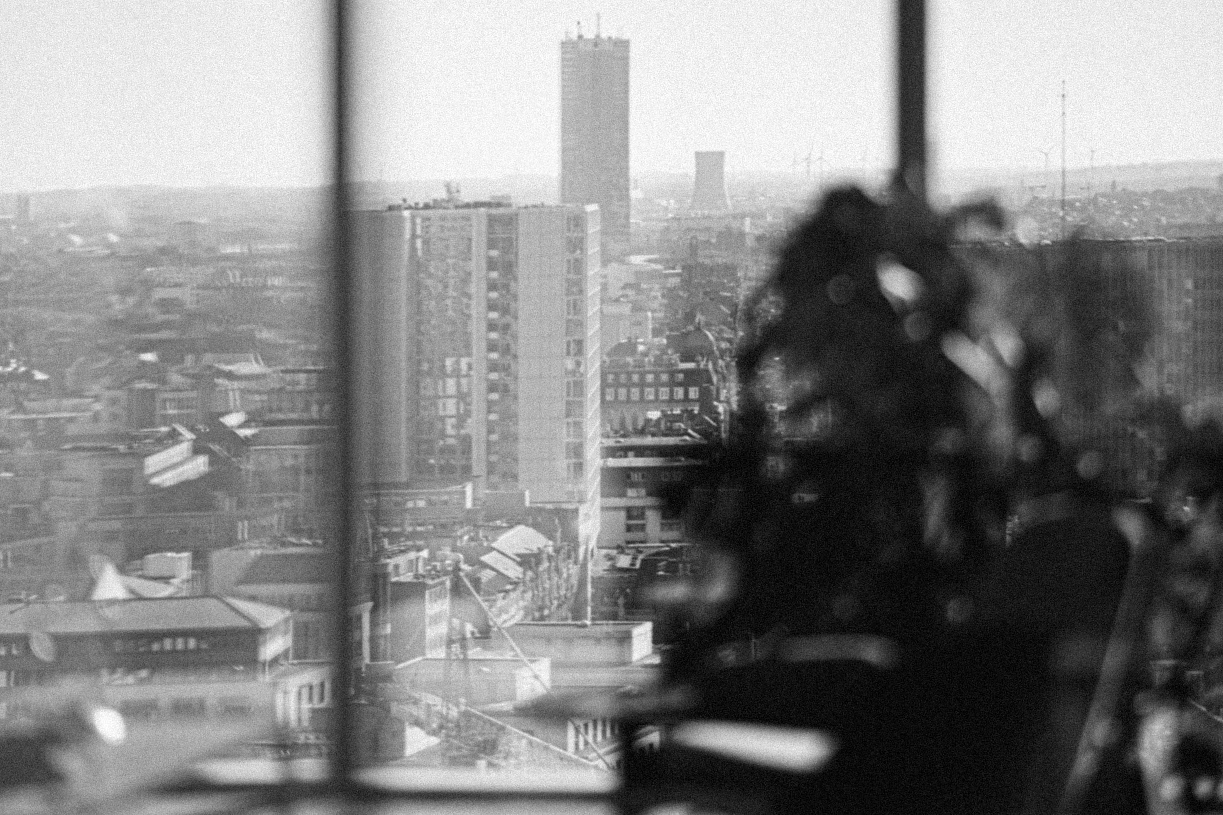
In the heart of Brussels, on Place Rogier, we find the iconic office building Manhattan. After years of vacancy, Icon Real Estate Group decided to invest and restore this iconic building. Creneau was responsible for the design and build of the entire 3rd floor offering a food and learning experience. The Executive office on the 23rd floor, the Ageas offices, the Meeting centre, the gym and Bike depot on the -2.
In the heart of Brussels, on Place Rogier, we find the iconic office building Manhattan. After years of vacancy, Icon Real Estate Group decided to invest and restore this iconic building. Creneau was responsible for the design and build of the entire 3rd floor offering a food and learning experience. The Executive office on the 23rd floor, the Ageas offices, the Meeting centre, the gym and Bike depot on the -2.


Research
In the heart of Brussels, on Place Rogier, we find the iconic office building Manhattan. After years of vacancy, Icon Real Estate Group decided to invest and restore this iconic building. Creneau was responsible for the design and build of the entire 3rd floor offering a food and learning experience. The Executive office on the 23rd floor, the Ageas offices, the Meeting centre, the gym and Bike depot on the -2.

Concept

Design

Build
In the heart of Brussels, on Place Rogier, we find the iconic office building Manhattan. After years of vacancy, Icon Real Estate Group decided to invest and restore this iconic building. Creneau was responsible for the design and build of the entire 3rd floor offering a food and learning experience. The Executive office on the 23rd floor, the Ageas offices, the Meeting centre, the gym and Bike depot on the -2.
In the heart of Brussels, on Place Rogier, we find the iconic office building Manhattan. After years of vacancy, Icon Real Estate Group decided to invest and restore this iconic building. Creneau was responsible for the design and build of the entire 3rd floor offering a food and learning experience. The Executive office on the 23rd floor, the Ageas offices, the Meeting centre, the gym and Bike depot on the -2.
In the heart of Brussels, on Place Rogier, we find the iconic office building Manhattan. After years of vacancy, Icon Real Estate Group decided to invest and restore this iconic building. Creneau was responsible for the design and build of the entire 3rd floor offering a food and learning experience. The Executive office on the 23rd floor, the Ageas offices, the Meeting centre, the gym and Bike depot on the -2.

In the heart of Brussels, on Place Rogier, we find the iconic office building Manhattan. After years of vacancy, Icon Real Estate Group decided to invest and restore this iconic building. Creneau was responsible for the design and build of the entire 3rd floor offering a food and learning experience. The Executive office on the 23rd floor, the Ageas offices, the Meeting centre, the gym and Bike depot on the -2.
In the heart of Brussels, on Place Rogier, we find the iconic office building Manhattan. After years of vacancy, Icon Real Estate Group decided to invest and restore this iconic building. Creneau was responsible for the design and build of the entire 3rd floor offering a food and learning experience. The Executive office on the 23rd floor, the Ageas offices, the Meeting centre, the gym and Bike depot on the -2.
In the heart of Brussels, on Place Rogier, we find the iconic office building Manhattan. After years of vacancy, Icon Real Estate Group decided to invest and restore this iconic building. Creneau was responsible for the design and build of the entire 3rd floor offering a food and learning experience. The Executive office on the 23rd floor, the Ageas offices, the Meeting centre, the gym and Bike depot on the -2.



Research

Concept

Design

Build


The Manhattan building was erected end 60’s beginning 70’s. Urban visionaries then pictured Brussels as a layered city where the bottom layer would be destined for trafic and a second toplayer would be a traffic free open space with shops and parks . The remnants of this big plan can still be seen in the existing plint of the building. This past future vision called ‘retro-future’ became our style-guide when designing the Manhattan project.
The Manhattan building was erected end 60’s beginning 70’s. Urban visionaries then pictured Brussels as a layered city where the bottom layer would be destined for trafic and a second toplayer would be a traffic free open space with shops and parks . The remnants of this big plan can still be seen in the existing plint of the building. This past future vision called ‘retro-future’ became our style-guide when designing the Manhattan project.


Research
The Manhattan building was erected end 60’s beginning 70’s. Urban visionaries then pictured Brussels as a layered city where the bottom layer would be destined for trafic and a second toplayer would be a traffic free open space with shops and parks . The remnants of this big plan can still be seen in the existing plint of the building. This past future vision called ‘retro-future’ became our style-guide when designing the Manhattan project.

Concept

Design

Build

The Manhattan building was erected end 60’s beginning 70’s. Urban visionaries then pictured Brussels as a layered city where the bottom layer would be destined for trafic and a second toplayer would be a traffic free open space with shops and parks . The remnants of this big plan can still be seen in the existing plint of the building. This past future vision called ‘retro-future’ became our style-guide when designing the Manhattan project.


The Manhattan building was erected end 60’s beginning 70’s. Urban visionaries then pictured Brussels as a layered city where the bottom layer would be destined for trafic and a second toplayer would be a traffic free open space with shops and parks . The remnants of this big plan can still be seen in the existing plint of the building. This past future vision called ‘retro-future’ became our style-guide when designing the Manhattan project.

The Manhattan building was erected end 60’s beginning 70’s. Urban visionaries then pictured Brussels as a layered city where the bottom layer would be destined for trafic and a second toplayer would be a traffic free open space with shops and parks . The remnants of this big plan can still be seen in the existing plint of the building. This past future vision called ‘retro-future’ became our style-guide when designing the Manhattan project.

The Manhattan building was erected end 60’s beginning 70’s. Urban visionaries then pictured Brussels as a layered city where the bottom layer would be destined for trafic and a second toplayer would be a traffic free open space with shops and parks . The remnants of this big plan can still be seen in the existing plint of the building. This past future vision called ‘retro-future’ became our style-guide when designing the Manhattan project.
The Manhattan building was erected end 60’s beginning 70’s. Urban visionaries then pictured Brussels as a layered city where the bottom layer would be destined for trafic and a second toplayer would be a traffic free open space with shops and parks . The remnants of this big plan can still be seen in the existing plint of the building. This past future vision called ‘retro-future’ became our style-guide when designing the Manhattan project.


The Manhattan building was erected end 60’s beginning 70’s. Urban visionaries then pictured Brussels as a layered city where the bottom layer would be destined for trafic and a second toplayer would be a traffic free open space with shops and parks . The remnants of this big plan can still be seen in the existing plint of the building. This past future vision called ‘retro-future’ became our style-guide when designing the Manhattan project.


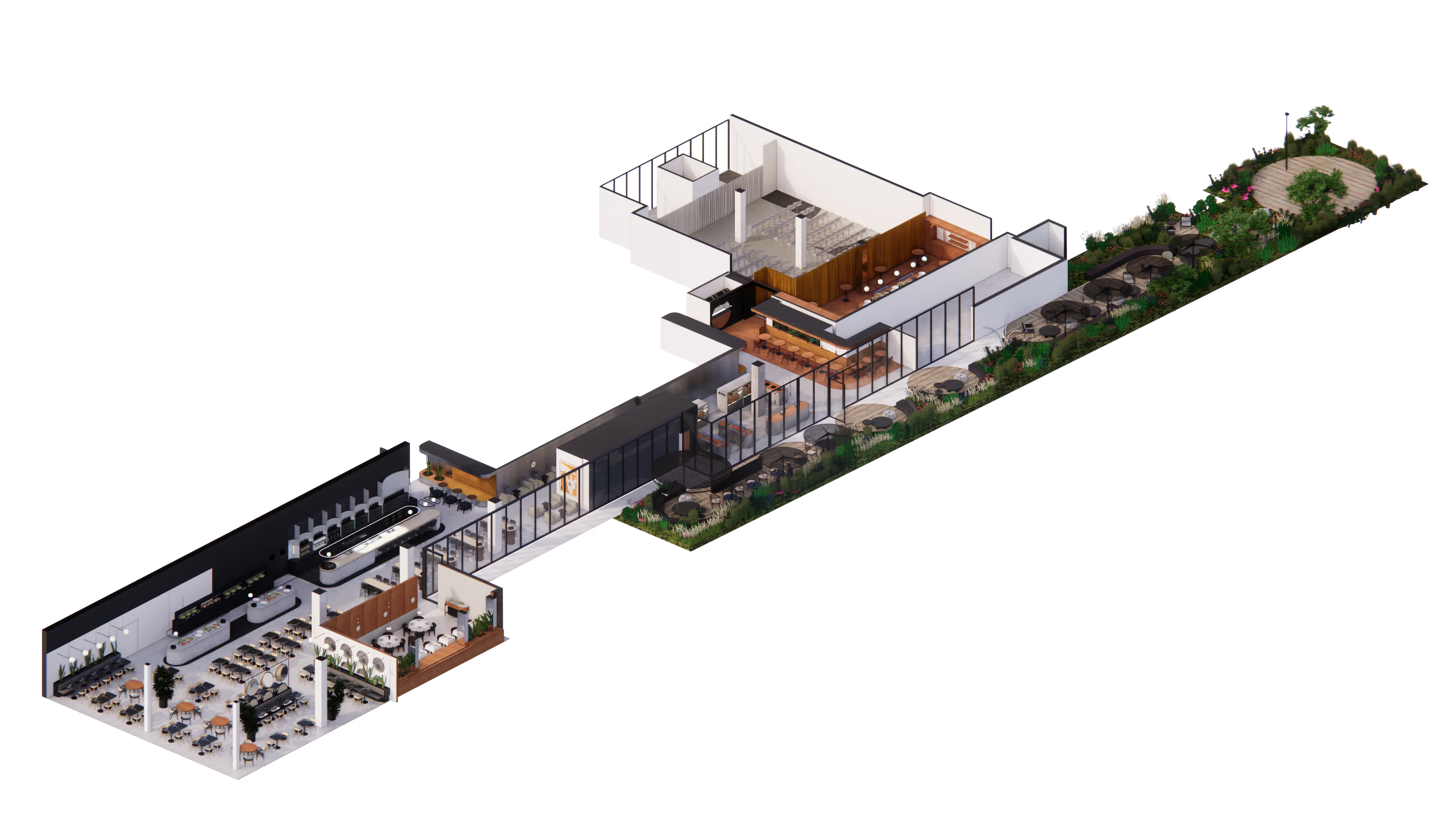
Hospitality is king, also in the Manhattan tower. Admit it, an office where you can have breakfast, lunch, snacks, apero’s and dinners without having to hit the capitol’s traffic… that’s luxury. The entire third floor is a fine example of teamwork between Belgocatering, Icon and Creneau International. We designed four different hospitality concepts, ranging from a coffee shop to a fine dining restaurant.
Hospitality is king, also in the Manhattan tower. Admit it, an office where you can have breakfast, lunch, snacks, apero’s and dinners without having to hit the capitol’s traffic… that’s luxury. The entire third floor is a fine example of teamwork between Belgocatering, Icon and Creneau International. We designed four different hospitality concepts, ranging from a coffee shop to a fine dining restaurant.


Research
Hospitality is king, also in the Manhattan tower. Admit it, an office where you can have breakfast, lunch, snacks, apero’s and dinners without having to hit the capitol’s traffic… that’s luxury. The entire third floor is a fine example of teamwork between Belgocatering, Icon and Creneau International. We designed four different hospitality concepts, ranging from a coffee shop to a fine dining restaurant.

Concept

Design

Build
Hospitality is king, also in the Manhattan tower. Admit it, an office where you can have breakfast, lunch, snacks, apero’s and dinners without having to hit the capitol’s traffic… that’s luxury. The entire third floor is a fine example of teamwork between Belgocatering, Icon and Creneau International. We designed four different hospitality concepts, ranging from a coffee shop to a fine dining restaurant.
Hospitality is king, also in the Manhattan tower. Admit it, an office where you can have breakfast, lunch, snacks, apero’s and dinners without having to hit the capitol’s traffic… that’s luxury. The entire third floor is a fine example of teamwork between Belgocatering, Icon and Creneau International. We designed four different hospitality concepts, ranging from a coffee shop to a fine dining restaurant.
Hospitality is king, also in the Manhattan tower. Admit it, an office where you can have breakfast, lunch, snacks, apero’s and dinners without having to hit the capitol’s traffic… that’s luxury. The entire third floor is a fine example of teamwork between Belgocatering, Icon and Creneau International. We designed four different hospitality concepts, ranging from a coffee shop to a fine dining restaurant.

Hospitality is king, also in the Manhattan tower. Admit it, an office where you can have breakfast, lunch, snacks, apero’s and dinners without having to hit the capitol’s traffic… that’s luxury. The entire third floor is a fine example of teamwork between Belgocatering, Icon and Creneau International. We designed four different hospitality concepts, ranging from a coffee shop to a fine dining restaurant.
Hospitality is king, also in the Manhattan tower. Admit it, an office where you can have breakfast, lunch, snacks, apero’s and dinners without having to hit the capitol’s traffic… that’s luxury. The entire third floor is a fine example of teamwork between Belgocatering, Icon and Creneau International. We designed four different hospitality concepts, ranging from a coffee shop to a fine dining restaurant.
Hospitality is king, also in the Manhattan tower. Admit it, an office where you can have breakfast, lunch, snacks, apero’s and dinners without having to hit the capitol’s traffic… that’s luxury. The entire third floor is a fine example of teamwork between Belgocatering, Icon and Creneau International. We designed four different hospitality concepts, ranging from a coffee shop to a fine dining restaurant.


Research

Concept

Design

Build


The Lex is the beating heart of the third floor. It’s a place to wake up in the early morning with a nice cup of coffee, to work away from your desk or to relax after work with a glass of wine. All while gazing upon a spectacular view of Brussels. We worked with geometry and round shapes. Materials come in natural and tempered hues. There are many contrasts going on: shiny, raw, soft, hard, beige and anthracite.
The Lex is the beating heart of the third floor. It’s a place to wake up in the early morning with a nice cup of coffee, to work away from your desk or to relax after work with a glass of wine. All while gazing upon a spectacular view of Brussels. We worked with geometry and round shapes. Materials come in natural and tempered hues. There are many contrasts going on: shiny, raw, soft, hard, beige and anthracite.


Research
The Lex is the beating heart of the third floor. It’s a place to wake up in the early morning with a nice cup of coffee, to work away from your desk or to relax after work with a glass of wine. All while gazing upon a spectacular view of Brussels. We worked with geometry and round shapes. Materials come in natural and tempered hues. There are many contrasts going on: shiny, raw, soft, hard, beige and anthracite.

Concept

Design

Build

The Lex is the beating heart of the third floor. It’s a place to wake up in the early morning with a nice cup of coffee, to work away from your desk or to relax after work with a glass of wine. All while gazing upon a spectacular view of Brussels. We worked with geometry and round shapes. Materials come in natural and tempered hues. There are many contrasts going on: shiny, raw, soft, hard, beige and anthracite.


The Lex is the beating heart of the third floor. It’s a place to wake up in the early morning with a nice cup of coffee, to work away from your desk or to relax after work with a glass of wine. All while gazing upon a spectacular view of Brussels. We worked with geometry and round shapes. Materials come in natural and tempered hues. There are many contrasts going on: shiny, raw, soft, hard, beige and anthracite.

The Lex is the beating heart of the third floor. It’s a place to wake up in the early morning with a nice cup of coffee, to work away from your desk or to relax after work with a glass of wine. All while gazing upon a spectacular view of Brussels. We worked with geometry and round shapes. Materials come in natural and tempered hues. There are many contrasts going on: shiny, raw, soft, hard, beige and anthracite.

The Lex is the beating heart of the third floor. It’s a place to wake up in the early morning with a nice cup of coffee, to work away from your desk or to relax after work with a glass of wine. All while gazing upon a spectacular view of Brussels. We worked with geometry and round shapes. Materials come in natural and tempered hues. There are many contrasts going on: shiny, raw, soft, hard, beige and anthracite.
The Lex is the beating heart of the third floor. It’s a place to wake up in the early morning with a nice cup of coffee, to work away from your desk or to relax after work with a glass of wine. All while gazing upon a spectacular view of Brussels. We worked with geometry and round shapes. Materials come in natural and tempered hues. There are many contrasts going on: shiny, raw, soft, hard, beige and anthracite.


The Lex is the beating heart of the third floor. It’s a place to wake up in the early morning with a nice cup of coffee, to work away from your desk or to relax after work with a glass of wine. All while gazing upon a spectacular view of Brussels. We worked with geometry and round shapes. Materials come in natural and tempered hues. There are many contrasts going on: shiny, raw, soft, hard, beige and anthracite.


Research

Concept

Design

Build




Research

Concept

Design

Build


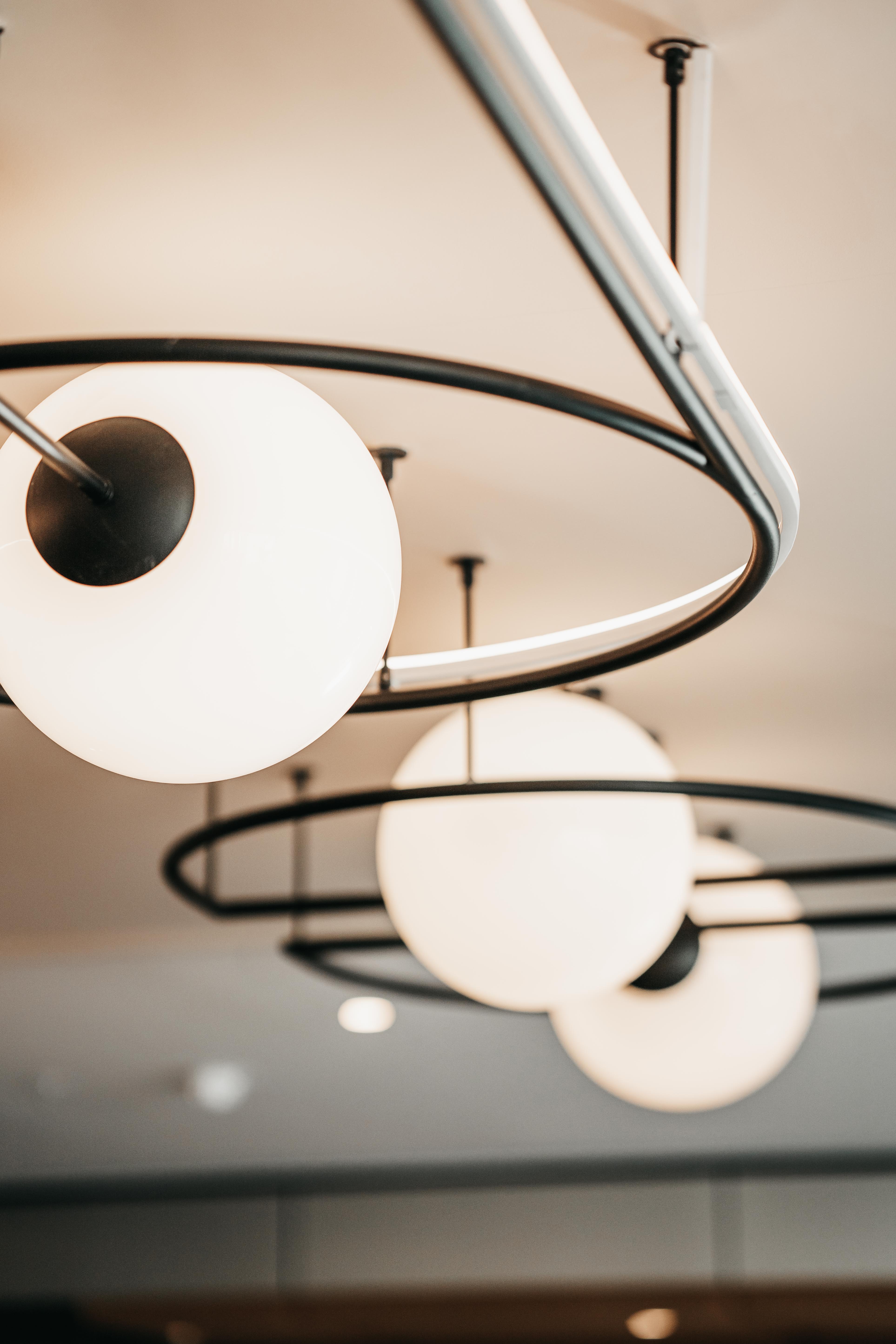
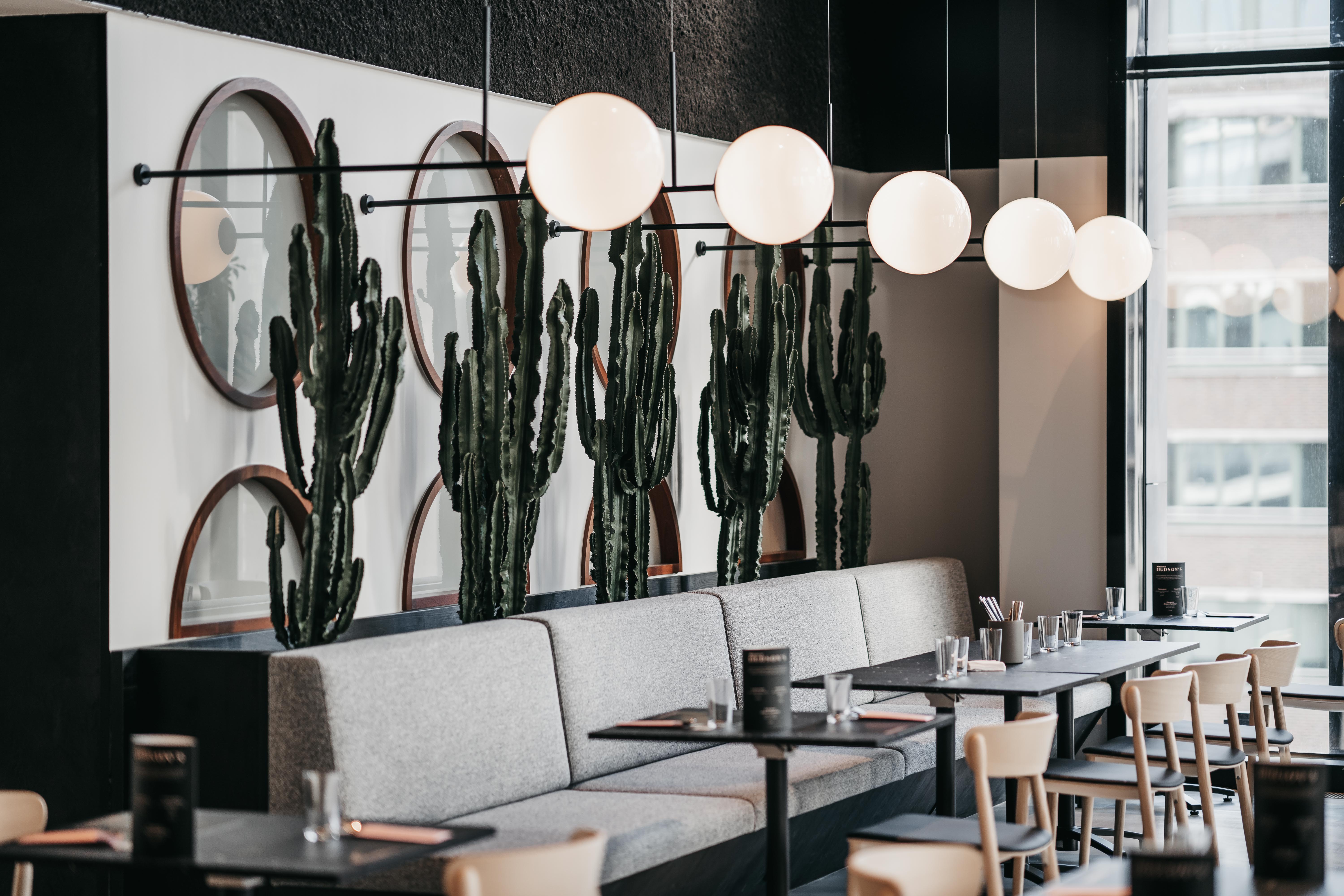
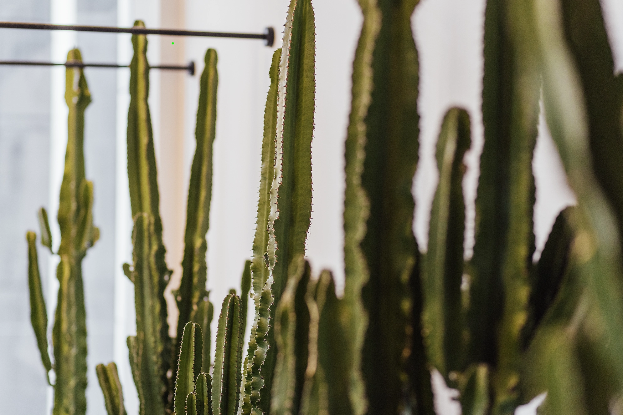
The Hudson is a great lunchspot. The Manhattan tenants wellbeing is clearly demonstrated: a healthy and varied lunch is on offer. Hudson’s is the only space with a 6-meter-high ceiling. To make the space even more impressive, we created a round mirrored ceiling with a diameter of 4 meter.
The Hudson is a great lunchspot. The Manhattan tenants wellbeing is clearly demonstrated: a healthy and varied lunch is on offer. Hudson’s is the only space with a 6-meter-high ceiling. To make the space even more impressive, we created a round mirrored ceiling with a diameter of 4 meter.


Research
The Hudson is a great lunchspot. The Manhattan tenants wellbeing is clearly demonstrated: a healthy and varied lunch is on offer. Hudson’s is the only space with a 6-meter-high ceiling. To make the space even more impressive, we created a round mirrored ceiling with a diameter of 4 meter.

Concept

Design

Build

The Hudson is a great lunchspot. The Manhattan tenants wellbeing is clearly demonstrated: a healthy and varied lunch is on offer. Hudson’s is the only space with a 6-meter-high ceiling. To make the space even more impressive, we created a round mirrored ceiling with a diameter of 4 meter.


The Hudson is a great lunchspot. The Manhattan tenants wellbeing is clearly demonstrated: a healthy and varied lunch is on offer. Hudson’s is the only space with a 6-meter-high ceiling. To make the space even more impressive, we created a round mirrored ceiling with a diameter of 4 meter.

The Hudson is a great lunchspot. The Manhattan tenants wellbeing is clearly demonstrated: a healthy and varied lunch is on offer. Hudson’s is the only space with a 6-meter-high ceiling. To make the space even more impressive, we created a round mirrored ceiling with a diameter of 4 meter.

The Hudson is a great lunchspot. The Manhattan tenants wellbeing is clearly demonstrated: a healthy and varied lunch is on offer. Hudson’s is the only space with a 6-meter-high ceiling. To make the space even more impressive, we created a round mirrored ceiling with a diameter of 4 meter.
The Hudson is a great lunchspot. The Manhattan tenants wellbeing is clearly demonstrated: a healthy and varied lunch is on offer. Hudson’s is the only space with a 6-meter-high ceiling. To make the space even more impressive, we created a round mirrored ceiling with a diameter of 4 meter.


The Hudson is a great lunchspot. The Manhattan tenants wellbeing is clearly demonstrated: a healthy and varied lunch is on offer. Hudson’s is the only space with a 6-meter-high ceiling. To make the space even more impressive, we created a round mirrored ceiling with a diameter of 4 meter.


Research

Concept

Design

Build




Research

Concept

Design

Build


Research

Concept

Design

Build




Research

Concept

Design

Build


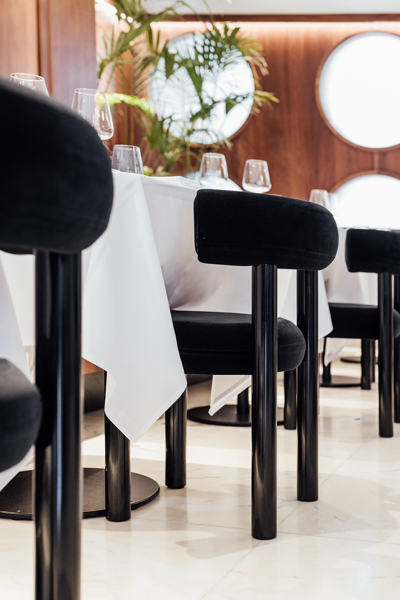
Hidden between The Lex and Hudson’s lies the fine dining restaurant Number 94 ment for discrete encounters. Neither trouble nor expense was spared to give this space an exclusive look and feel. The walls are made of teakwood, there’s a floor in pink Portugese marble, Tom Dixon chairs and skirting made of Ceppo Di Gré. The style of the restaurant is inspired by past-futurism from the seventies, the time Manhattan was originally built.
Hidden between The Lex and Hudson’s lies the fine dining restaurant Number 94 ment for discrete encounters. Neither trouble nor expense was spared to give this space an exclusive look and feel. The walls are made of teakwood, there’s a floor in pink Portugese marble, Tom Dixon chairs and skirting made of Ceppo Di Gré. The style of the restaurant is inspired by past-futurism from the seventies, the time Manhattan was originally built.



Research
Hidden between The Lex and Hudson’s lies the fine dining restaurant Number 94 ment for discrete encounters. Neither trouble nor expense was spared to give this space an exclusive look and feel. The walls are made of teakwood, there’s a floor in pink Portugese marble, Tom Dixon chairs and skirting made of Ceppo Di Gré. The style of the restaurant is inspired by past-futurism from the seventies, the time Manhattan was originally built.

Concept

Design

Build

Hidden between The Lex and Hudson’s lies the fine dining restaurant Number 94 ment for discrete encounters. Neither trouble nor expense was spared to give this space an exclusive look and feel. The walls are made of teakwood, there’s a floor in pink Portugese marble, Tom Dixon chairs and skirting made of Ceppo Di Gré. The style of the restaurant is inspired by past-futurism from the seventies, the time Manhattan was originally built.


Hidden between The Lex and Hudson’s lies the fine dining restaurant Number 94 ment for discrete encounters. Neither trouble nor expense was spared to give this space an exclusive look and feel. The walls are made of teakwood, there’s a floor in pink Portugese marble, Tom Dixon chairs and skirting made of Ceppo Di Gré. The style of the restaurant is inspired by past-futurism from the seventies, the time Manhattan was originally built.

Hidden between The Lex and Hudson’s lies the fine dining restaurant Number 94 ment for discrete encounters. Neither trouble nor expense was spared to give this space an exclusive look and feel. The walls are made of teakwood, there’s a floor in pink Portugese marble, Tom Dixon chairs and skirting made of Ceppo Di Gré. The style of the restaurant is inspired by past-futurism from the seventies, the time Manhattan was originally built.

Hidden between The Lex and Hudson’s lies the fine dining restaurant Number 94 ment for discrete encounters. Neither trouble nor expense was spared to give this space an exclusive look and feel. The walls are made of teakwood, there’s a floor in pink Portugese marble, Tom Dixon chairs and skirting made of Ceppo Di Gré. The style of the restaurant is inspired by past-futurism from the seventies, the time Manhattan was originally built.
Hidden between The Lex and Hudson’s lies the fine dining restaurant Number 94 ment for discrete encounters. Neither trouble nor expense was spared to give this space an exclusive look and feel. The walls are made of teakwood, there’s a floor in pink Portugese marble, Tom Dixon chairs and skirting made of Ceppo Di Gré. The style of the restaurant is inspired by past-futurism from the seventies, the time Manhattan was originally built.


Hidden between The Lex and Hudson’s lies the fine dining restaurant Number 94 ment for discrete encounters. Neither trouble nor expense was spared to give this space an exclusive look and feel. The walls are made of teakwood, there’s a floor in pink Portugese marble, Tom Dixon chairs and skirting made of Ceppo Di Gré. The style of the restaurant is inspired by past-futurism from the seventies, the time Manhattan was originally built.


Research

Concept

Design

Build


Research

Concept

Design

Build




Research

Concept

Design

Build


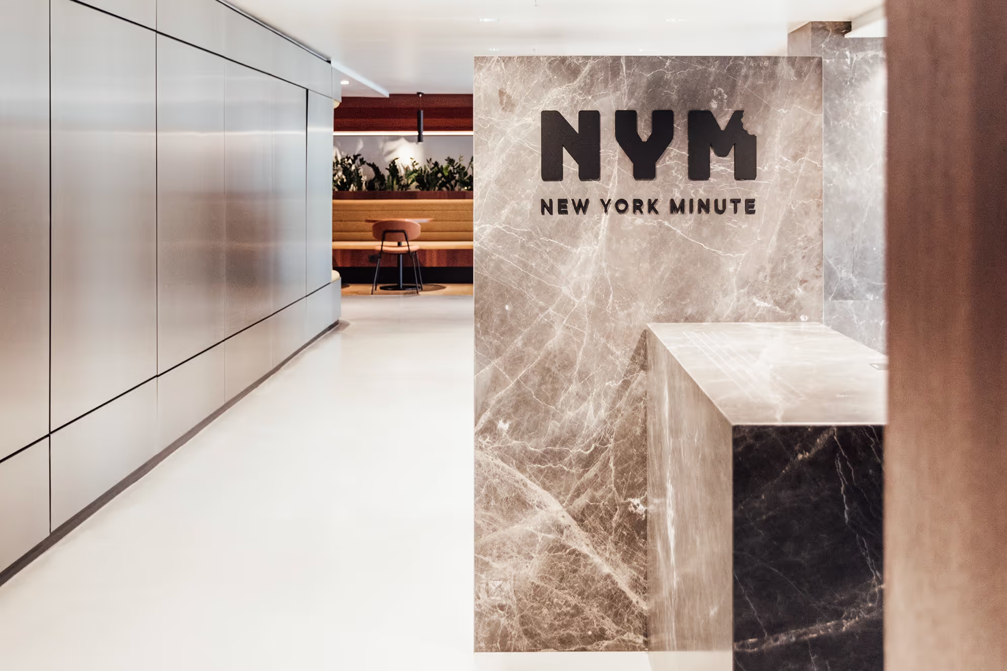
Around the corner of The Lex, you can find the retail outlet New York Minute. This grab & go-concept offers a quick bite. Sleek and reflective materials such as the aluminium cladding and marble, reflects the ‘past-futurism’ character of Manhattan. A cozy seating area is located next to the NYM and this way you’ll reach the terrace with a beautiful botanical garden, from where you’ll see the best of Brussels.
Around the corner of The Lex, you can find the retail outlet New York Minute. This grab & go-concept offers a quick bite. Sleek and reflective materials such as the aluminium cladding and marble, reflects the ‘past-futurism’ character of Manhattan. A cozy seating area is located next to the NYM and this way you’ll reach the terrace with a beautiful botanical garden, from where you’ll see the best of Brussels.


Research
Around the corner of The Lex, you can find the retail outlet New York Minute. This grab & go-concept offers a quick bite. Sleek and reflective materials such as the aluminium cladding and marble, reflects the ‘past-futurism’ character of Manhattan. A cozy seating area is located next to the NYM and this way you’ll reach the terrace with a beautiful botanical garden, from where you’ll see the best of Brussels.

Concept

Design

Build

Around the corner of The Lex, you can find the retail outlet New York Minute. This grab & go-concept offers a quick bite. Sleek and reflective materials such as the aluminium cladding and marble, reflects the ‘past-futurism’ character of Manhattan. A cozy seating area is located next to the NYM and this way you’ll reach the terrace with a beautiful botanical garden, from where you’ll see the best of Brussels.


Around the corner of The Lex, you can find the retail outlet New York Minute. This grab & go-concept offers a quick bite. Sleek and reflective materials such as the aluminium cladding and marble, reflects the ‘past-futurism’ character of Manhattan. A cozy seating area is located next to the NYM and this way you’ll reach the terrace with a beautiful botanical garden, from where you’ll see the best of Brussels.

Around the corner of The Lex, you can find the retail outlet New York Minute. This grab & go-concept offers a quick bite. Sleek and reflective materials such as the aluminium cladding and marble, reflects the ‘past-futurism’ character of Manhattan. A cozy seating area is located next to the NYM and this way you’ll reach the terrace with a beautiful botanical garden, from where you’ll see the best of Brussels.

Around the corner of The Lex, you can find the retail outlet New York Minute. This grab & go-concept offers a quick bite. Sleek and reflective materials such as the aluminium cladding and marble, reflects the ‘past-futurism’ character of Manhattan. A cozy seating area is located next to the NYM and this way you’ll reach the terrace with a beautiful botanical garden, from where you’ll see the best of Brussels.
Around the corner of The Lex, you can find the retail outlet New York Minute. This grab & go-concept offers a quick bite. Sleek and reflective materials such as the aluminium cladding and marble, reflects the ‘past-futurism’ character of Manhattan. A cozy seating area is located next to the NYM and this way you’ll reach the terrace with a beautiful botanical garden, from where you’ll see the best of Brussels.


Around the corner of The Lex, you can find the retail outlet New York Minute. This grab & go-concept offers a quick bite. Sleek and reflective materials such as the aluminium cladding and marble, reflects the ‘past-futurism’ character of Manhattan. A cozy seating area is located next to the NYM and this way you’ll reach the terrace with a beautiful botanical garden, from where you’ll see the best of Brussels.


Research

Concept

Design

Build




Research

Concept

Design

Build


Research

Concept

Design

Build


Research

Concept

Design

Build




Research

Concept

Design

Build


Research

Concept

Design

Build


Research

Concept

Design

Build


Research

Concept

Design

Build


Research

Concept

Design

Build


Research

Concept

Design

Build


_Page_04.avif)

_Page_04.avif)

_Page_04.avif)
_Page_04.avif)
Research

Concept

Design

Build
_Page_04.avif)
_Page_04.avif)
_Page_04.avif)
_Page_04.avif)
_Page_04.avif)
_Page_04.avif)
_Page_04.avif)
_Page_04.avif)
_Page_04.avif)
_Page_04.avif)
_Page_04.avif)
_Page_04.avif)
_Page_04.avif)
_Page_04.avif)
_Page_04.avif)
_Page_04.avif)
_Page_05.avif)

_Page_05.avif)

_Page_05.avif)
_Page_05.avif)
Research

Concept

Design

Build
_Page_05.avif)
_Page_05.avif)
_Page_05.avif)
_Page_05.avif)
_Page_05.avif)
_Page_05.avif)
_Page_05.avif)
_Page_05.avif)
_Page_05.avif)
_Page_05.avif)
_Page_05.avif)
_Page_05.avif)
_Page_05.avif)
_Page_05.avif)
_Page_05.avif)
_Page_05.avif)


Research

Concept

Design

Build


Research

Concept

Design

Build


Research

Concept

Design

Build


