After 16 years, liquid gold will fill the pipes of City Brewery De Maastrichter Maltezer once again. The brewery launches their new corporate identity, made with love by Creneau International. We went by, had a taste and enjoyed the Maltezer beer and the lovely view.
After 16 years, liquid gold will fill the pipes of City Brewery De Maastrichter Maltezer once again. The brewery launches their new corporate identity, made with love by Creneau International. We went by, had a taste and enjoyed the Maltezer beer and the lovely view.


Research
After 16 years, liquid gold will fill the pipes of City Brewery De Maastrichter Maltezer once again. The brewery launches their new corporate identity, made with love by Creneau International. We went by, had a taste and enjoyed the Maltezer beer and the lovely view.

Concept

Design

Build
After 16 years, liquid gold will fill the pipes of City Brewery De Maastrichter Maltezer once again. The brewery launches their new corporate identity, made with love by Creneau International. We went by, had a taste and enjoyed the Maltezer beer and the lovely view.
After 16 years, liquid gold will fill the pipes of City Brewery De Maastrichter Maltezer once again. The brewery launches their new corporate identity, made with love by Creneau International. We went by, had a taste and enjoyed the Maltezer beer and the lovely view.
After 16 years, liquid gold will fill the pipes of City Brewery De Maastrichter Maltezer once again. The brewery launches their new corporate identity, made with love by Creneau International. We went by, had a taste and enjoyed the Maltezer beer and the lovely view.

After 16 years, liquid gold will fill the pipes of City Brewery De Maastrichter Maltezer once again. The brewery launches their new corporate identity, made with love by Creneau International. We went by, had a taste and enjoyed the Maltezer beer and the lovely view.
After 16 years, liquid gold will fill the pipes of City Brewery De Maastrichter Maltezer once again. The brewery launches their new corporate identity, made with love by Creneau International. We went by, had a taste and enjoyed the Maltezer beer and the lovely view.
After 16 years, liquid gold will fill the pipes of City Brewery De Maastrichter Maltezer once again. The brewery launches their new corporate identity, made with love by Creneau International. We went by, had a taste and enjoyed the Maltezer beer and the lovely view.


Research

Concept

Design

Build


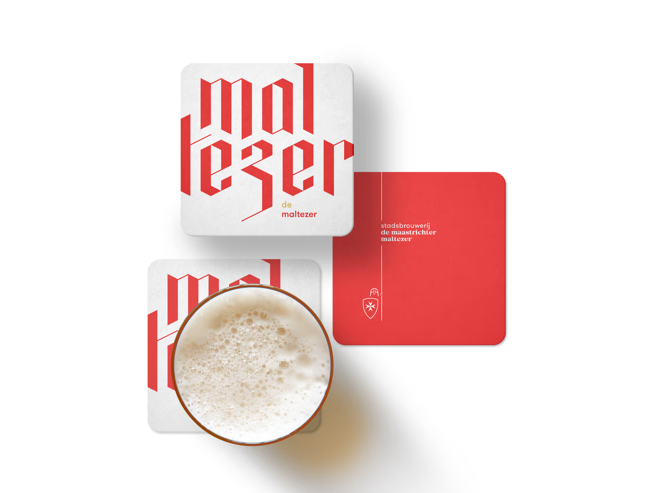
The city brewery is running at full steam again and the Maltezer beer is restored to its former glory. According to owners Tom de Lepper and Charles van Goch the relaunch needed to be paired with a new corporate identity, and that’s where Creneau International comes in. A new logo was created for City Brewery De Maastrichter Maltezer. The logo appears throughout the entire branding of the brewery. You’ll recognize it on the façade, on the beer mats, the glasses and more. The Maltezer beer will be poured from a new bottle designed by Creneau International as well.
The city brewery is running at full steam again and the Maltezer beer is restored to its former glory. According to owners Tom de Lepper and Charles van Goch the relaunch needed to be paired with a new corporate identity, and that’s where Creneau International comes in. A new logo was created for City Brewery De Maastrichter Maltezer. The logo appears throughout the entire branding of the brewery. You’ll recognize it on the façade, on the beer mats, the glasses and more. The Maltezer beer will be poured from a new bottle designed by Creneau International as well.


Research
The city brewery is running at full steam again and the Maltezer beer is restored to its former glory. According to owners Tom de Lepper and Charles van Goch the relaunch needed to be paired with a new corporate identity, and that’s where Creneau International comes in. A new logo was created for City Brewery De Maastrichter Maltezer. The logo appears throughout the entire branding of the brewery. You’ll recognize it on the façade, on the beer mats, the glasses and more. The Maltezer beer will be poured from a new bottle designed by Creneau International as well.

Concept

Design

Build

The city brewery is running at full steam again and the Maltezer beer is restored to its former glory. According to owners Tom de Lepper and Charles van Goch the relaunch needed to be paired with a new corporate identity, and that’s where Creneau International comes in. A new logo was created for City Brewery De Maastrichter Maltezer. The logo appears throughout the entire branding of the brewery. You’ll recognize it on the façade, on the beer mats, the glasses and more. The Maltezer beer will be poured from a new bottle designed by Creneau International as well.


The city brewery is running at full steam again and the Maltezer beer is restored to its former glory. According to owners Tom de Lepper and Charles van Goch the relaunch needed to be paired with a new corporate identity, and that’s where Creneau International comes in. A new logo was created for City Brewery De Maastrichter Maltezer. The logo appears throughout the entire branding of the brewery. You’ll recognize it on the façade, on the beer mats, the glasses and more. The Maltezer beer will be poured from a new bottle designed by Creneau International as well.

The city brewery is running at full steam again and the Maltezer beer is restored to its former glory. According to owners Tom de Lepper and Charles van Goch the relaunch needed to be paired with a new corporate identity, and that’s where Creneau International comes in. A new logo was created for City Brewery De Maastrichter Maltezer. The logo appears throughout the entire branding of the brewery. You’ll recognize it on the façade, on the beer mats, the glasses and more. The Maltezer beer will be poured from a new bottle designed by Creneau International as well.

The city brewery is running at full steam again and the Maltezer beer is restored to its former glory. According to owners Tom de Lepper and Charles van Goch the relaunch needed to be paired with a new corporate identity, and that’s where Creneau International comes in. A new logo was created for City Brewery De Maastrichter Maltezer. The logo appears throughout the entire branding of the brewery. You’ll recognize it on the façade, on the beer mats, the glasses and more. The Maltezer beer will be poured from a new bottle designed by Creneau International as well.
The city brewery is running at full steam again and the Maltezer beer is restored to its former glory. According to owners Tom de Lepper and Charles van Goch the relaunch needed to be paired with a new corporate identity, and that’s where Creneau International comes in. A new logo was created for City Brewery De Maastrichter Maltezer. The logo appears throughout the entire branding of the brewery. You’ll recognize it on the façade, on the beer mats, the glasses and more. The Maltezer beer will be poured from a new bottle designed by Creneau International as well.


The city brewery is running at full steam again and the Maltezer beer is restored to its former glory. According to owners Tom de Lepper and Charles van Goch the relaunch needed to be paired with a new corporate identity, and that’s where Creneau International comes in. A new logo was created for City Brewery De Maastrichter Maltezer. The logo appears throughout the entire branding of the brewery. You’ll recognize it on the façade, on the beer mats, the glasses and more. The Maltezer beer will be poured from a new bottle designed by Creneau International as well.


Research

Concept

Design

Build


The logo is based on an old logo of city brewery De Ridder. However, the knight in the old logo had a bit of a militant attitude. Aiming to give the brand a friendlier look, the knight now strikes a more appealing pose. It better represents the activities of the Maltese knights as well. The Order of Malta actively supports medical care and assistance in disaster and conflict areas. The Maltese cross on the knight’s shield refers to this chivalric order.
The logo is based on an old logo of city brewery De Ridder. However, the knight in the old logo had a bit of a militant attitude. Aiming to give the brand a friendlier look, the knight now strikes a more appealing pose. It better represents the activities of the Maltese knights as well. The Order of Malta actively supports medical care and assistance in disaster and conflict areas. The Maltese cross on the knight’s shield refers to this chivalric order.


Research
The logo is based on an old logo of city brewery De Ridder. However, the knight in the old logo had a bit of a militant attitude. Aiming to give the brand a friendlier look, the knight now strikes a more appealing pose. It better represents the activities of the Maltese knights as well. The Order of Malta actively supports medical care and assistance in disaster and conflict areas. The Maltese cross on the knight’s shield refers to this chivalric order.

Concept

Design

Build
The logo is based on an old logo of city brewery De Ridder. However, the knight in the old logo had a bit of a militant attitude. Aiming to give the brand a friendlier look, the knight now strikes a more appealing pose. It better represents the activities of the Maltese knights as well. The Order of Malta actively supports medical care and assistance in disaster and conflict areas. The Maltese cross on the knight’s shield refers to this chivalric order.
The logo is based on an old logo of city brewery De Ridder. However, the knight in the old logo had a bit of a militant attitude. Aiming to give the brand a friendlier look, the knight now strikes a more appealing pose. It better represents the activities of the Maltese knights as well. The Order of Malta actively supports medical care and assistance in disaster and conflict areas. The Maltese cross on the knight’s shield refers to this chivalric order.
The logo is based on an old logo of city brewery De Ridder. However, the knight in the old logo had a bit of a militant attitude. Aiming to give the brand a friendlier look, the knight now strikes a more appealing pose. It better represents the activities of the Maltese knights as well. The Order of Malta actively supports medical care and assistance in disaster and conflict areas. The Maltese cross on the knight’s shield refers to this chivalric order.

The logo is based on an old logo of city brewery De Ridder. However, the knight in the old logo had a bit of a militant attitude. Aiming to give the brand a friendlier look, the knight now strikes a more appealing pose. It better represents the activities of the Maltese knights as well. The Order of Malta actively supports medical care and assistance in disaster and conflict areas. The Maltese cross on the knight’s shield refers to this chivalric order.
The logo is based on an old logo of city brewery De Ridder. However, the knight in the old logo had a bit of a militant attitude. Aiming to give the brand a friendlier look, the knight now strikes a more appealing pose. It better represents the activities of the Maltese knights as well. The Order of Malta actively supports medical care and assistance in disaster and conflict areas. The Maltese cross on the knight’s shield refers to this chivalric order.
The logo is based on an old logo of city brewery De Ridder. However, the knight in the old logo had a bit of a militant attitude. Aiming to give the brand a friendlier look, the knight now strikes a more appealing pose. It better represents the activities of the Maltese knights as well. The Order of Malta actively supports medical care and assistance in disaster and conflict areas. The Maltese cross on the knight’s shield refers to this chivalric order.
The typography on the beer bottle is based on Gothic calligraphic letters. This way we highlight the historic aspect, though in a way that is appealing to beer fanatics in the year 2018. Calligraphy requires a lot of craftsmanship, it’s an art in itself. Every single letter is put to paper with an incredible accuracy. We attribute the same kind of rigor and mastery to the beer that is brewed in De Maastrichter Maltezer.
The typography on the beer bottle is based on Gothic calligraphic letters. This way we highlight the historic aspect, though in a way that is appealing to beer fanatics in the year 2018. Calligraphy requires a lot of craftsmanship, it’s an art in itself. Every single letter is put to paper with an incredible accuracy. We attribute the same kind of rigor and mastery to the beer that is brewed in De Maastrichter Maltezer.


Research
The typography on the beer bottle is based on Gothic calligraphic letters. This way we highlight the historic aspect, though in a way that is appealing to beer fanatics in the year 2018. Calligraphy requires a lot of craftsmanship, it’s an art in itself. Every single letter is put to paper with an incredible accuracy. We attribute the same kind of rigor and mastery to the beer that is brewed in De Maastrichter Maltezer.

Concept

Design

Build

The typography on the beer bottle is based on Gothic calligraphic letters. This way we highlight the historic aspect, though in a way that is appealing to beer fanatics in the year 2018. Calligraphy requires a lot of craftsmanship, it’s an art in itself. Every single letter is put to paper with an incredible accuracy. We attribute the same kind of rigor and mastery to the beer that is brewed in De Maastrichter Maltezer.


The typography on the beer bottle is based on Gothic calligraphic letters. This way we highlight the historic aspect, though in a way that is appealing to beer fanatics in the year 2018. Calligraphy requires a lot of craftsmanship, it’s an art in itself. Every single letter is put to paper with an incredible accuracy. We attribute the same kind of rigor and mastery to the beer that is brewed in De Maastrichter Maltezer.

The typography on the beer bottle is based on Gothic calligraphic letters. This way we highlight the historic aspect, though in a way that is appealing to beer fanatics in the year 2018. Calligraphy requires a lot of craftsmanship, it’s an art in itself. Every single letter is put to paper with an incredible accuracy. We attribute the same kind of rigor and mastery to the beer that is brewed in De Maastrichter Maltezer.

The typography on the beer bottle is based on Gothic calligraphic letters. This way we highlight the historic aspect, though in a way that is appealing to beer fanatics in the year 2018. Calligraphy requires a lot of craftsmanship, it’s an art in itself. Every single letter is put to paper with an incredible accuracy. We attribute the same kind of rigor and mastery to the beer that is brewed in De Maastrichter Maltezer.
The typography on the beer bottle is based on Gothic calligraphic letters. This way we highlight the historic aspect, though in a way that is appealing to beer fanatics in the year 2018. Calligraphy requires a lot of craftsmanship, it’s an art in itself. Every single letter is put to paper with an incredible accuracy. We attribute the same kind of rigor and mastery to the beer that is brewed in De Maastrichter Maltezer.


The typography on the beer bottle is based on Gothic calligraphic letters. This way we highlight the historic aspect, though in a way that is appealing to beer fanatics in the year 2018. Calligraphy requires a lot of craftsmanship, it’s an art in itself. Every single letter is put to paper with an incredible accuracy. We attribute the same kind of rigor and mastery to the beer that is brewed in De Maastrichter Maltezer.




Research

Concept

Design

Build


Feel like tasting a freshly tapped Maltezer yourself? Go on and hurry to the brewery, they have a wonderful brasserie – with a terrace along the Maas – where you can enjoy a large variety of beers. And while you’re there, bring a souvenir from the beer shop that is run in collaboration with the Hoppy Brothers.
Feel like tasting a freshly tapped Maltezer yourself? Go on and hurry to the brewery, they have a wonderful brasserie – with a terrace along the Maas – where you can enjoy a large variety of beers. And while you’re there, bring a souvenir from the beer shop that is run in collaboration with the Hoppy Brothers.


Research
Feel like tasting a freshly tapped Maltezer yourself? Go on and hurry to the brewery, they have a wonderful brasserie – with a terrace along the Maas – where you can enjoy a large variety of beers. And while you’re there, bring a souvenir from the beer shop that is run in collaboration with the Hoppy Brothers.

Concept

Design

Build
Feel like tasting a freshly tapped Maltezer yourself? Go on and hurry to the brewery, they have a wonderful brasserie – with a terrace along the Maas – where you can enjoy a large variety of beers. And while you’re there, bring a souvenir from the beer shop that is run in collaboration with the Hoppy Brothers.
Feel like tasting a freshly tapped Maltezer yourself? Go on and hurry to the brewery, they have a wonderful brasserie – with a terrace along the Maas – where you can enjoy a large variety of beers. And while you’re there, bring a souvenir from the beer shop that is run in collaboration with the Hoppy Brothers.
Feel like tasting a freshly tapped Maltezer yourself? Go on and hurry to the brewery, they have a wonderful brasserie – with a terrace along the Maas – where you can enjoy a large variety of beers. And while you’re there, bring a souvenir from the beer shop that is run in collaboration with the Hoppy Brothers.

Feel like tasting a freshly tapped Maltezer yourself? Go on and hurry to the brewery, they have a wonderful brasserie – with a terrace along the Maas – where you can enjoy a large variety of beers. And while you’re there, bring a souvenir from the beer shop that is run in collaboration with the Hoppy Brothers.
Feel like tasting a freshly tapped Maltezer yourself? Go on and hurry to the brewery, they have a wonderful brasserie – with a terrace along the Maas – where you can enjoy a large variety of beers. And while you’re there, bring a souvenir from the beer shop that is run in collaboration with the Hoppy Brothers.
Feel like tasting a freshly tapped Maltezer yourself? Go on and hurry to the brewery, they have a wonderful brasserie – with a terrace along the Maas – where you can enjoy a large variety of beers. And while you’re there, bring a souvenir from the beer shop that is run in collaboration with the Hoppy Brothers.


